


Ruling Color on Tinted Paper: Contrast, Inks, and Print Specifications

Selecting the right ruling color on tinted paper requires balancing line contrast against the substrate's base shade using calibrated spot inks—such as warm or cool greys, muted earth tones, or opaque white—to ensure functional readability without distracting from handwriting or causing visual interference. By specifying targeted Pantone formulas, maintaining precise line weights between 0.25 pt and 0.5 pt, and evaluating ink absorption on colored fibers, notebook publishers achieve functional ergonomic structure and refined aesthetic appeal.
How does substrate shade affect ruling color on tinted paper?
Printing guidelines on tinted paper fundamentally differs from standard white offset printing because paper shade directly alters perceived ink luminance and chromaticity. Standard offset inks are translucent. When applied over a dyed or toned fiber substrate, the paper's underlying color filters through the ink film, shifting the final color and reducing luminance contrast.
When calculating the visual performance of ruling color on tinted paper, product engineers must account for three critical optical dynamics:
Background Luminance Shift: As the substrate darkens (such as kraft, sage, charcoal, or butter cream), the dynamic range between the page and traditional black or dark-grey ruling narrows, making dark rules appear visually heavy or harsh.
Color Cast Contamination: Transparent inks absorb the undertones of the paper stock. A neutral cool grey printed on yellow-toned cream paper shifts toward olive green, whereas the same grey on blush paper pulls mauve.
Visual Ergonomics: Notebook rulings (lines, dot grids, or engineered matrices) serve as background guides rather than foreground content. If the contrast is too high, the page feels cluttered; if the contrast is too low, users strain their eyes under low-light writing conditions.
To achieve optimal visual balance, production teams must measure the optical density of the tinted base sheet and formulate spot inks that provide a deliberate 15% to 25% contrast delta relative to the paper background.
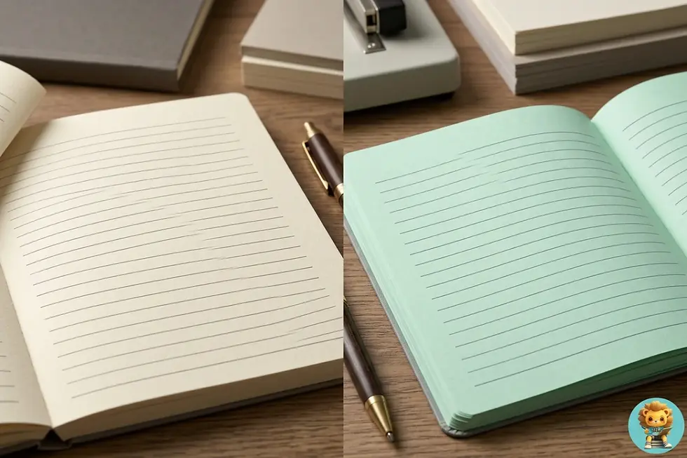
Matching ruling ink tone to substrate temperature prevents color cast contamination and reduces eye fatigue.
How do you balance tinted paper ruling contrast across different stock shades?
Managing tinted paper ruling contrast requires categorizing paper stocks by value (lightness) and hue, then pairing them with complementary ink values. A single universal ink formula cannot perform consistently across different paper stocks.
The following matrix outlines proven contrast pairings across popular colored text papers used in commercial stationery manufacturing:
Paper Stock Category | Typical Base Shades | Recommended Ruling Ink Approach | Target Ink Example | Recommended Line Weight |
|---|---|---|---|---|
:--- | :--- | :--- | :--- | :--- |
Warm Pastels | Cream, Warm Ivory, Pale Peach | Low-saturation warm grey or muted taupe | Pantone Warm Gray 1 U to 3 U | 0.25 pt – 0.35 pt |
Cool Pastels | Ice Blue, Mint, Pale Lavender | Low-saturation cool slate grey | Pantone Cool Gray 2 U to 4 U | 0.25 pt – 0.35 pt |
Mid-Tone Earth | Kraft, Sandstone, Mustard | Deep umber, rich espresso, or subtle charcoal | Pantone 411 U or Pantone 7532 U | 0.30 pt – 0.40 pt |
Vibrant Hues | Terracotta, Olive, Dusty Rose | Deepened tone-on-tone tint | 20–30% darker shade of base hue | 0.30 pt – 0.45 pt |
Deep / Dark | Charcoal, Midnight Navy, Forest Green | Opaque white, silver metallic, or high-opacity pastel | Opaque White (double pass) or Pantone 877 U | 0.40 pt – 0.50 pt |
For pastel stocks, the goal is subtle boundary definition where the line is noticeable during writing but recedes when reading a filled page. For mid-tone kraft, deep tinted inks are necessary to cut through unbleached, mottled wood fibers without spreading.
What are the best Pantone ruling ink for colored stock formulations?
Selecting a pantone ruling ink for colored stock requires choosing between standard offset spot inks, pigmented vegetable-based inks, opaque screen/offset inks, and specialty metallics based on manufacturing methods and design intent.
Standard Translucent Pantone Spot Inks (Uncoated Formulations): Best suited for light cream, ivory, and pastel paper stocks. By mixing transparent white extender with minute percentages of black, warm red, or cyan pigment, press operators create delicate shades (e.g., Pantone 7527 U or Pantone 400 U) that harmonize with paper tones without muddying.
Semi-Opaque Neutral Greys: When printing on mid-tone paper stocks like unbleached kraft, standard transparent greys lose definition. Formulating spot inks with higher titanium dioxide (TiO2) white pigment loading ensures the ink film sits on top of the fibrous surface rather than sinking into it.
Opaque White Offset Inks: For dark, moody, or intensely dyed papers, opaque white is standard. Because a single offset pass of opaque white yields a translucent milk-glass look on dark stocks, production specifications often call for a double-hit (two consecutive print units laying down opaque white) or a dedicated UV-cured screen printing pass for maximum vibrancy.
Metallic Spot Inks (Silver & Pale Gold): Metallic inks naturally contain reflective aluminum or bronze flakes that block substrate show-through. A subtle Pantone 877 U (Silver) on charcoal or deep navy paper creates a clean, industrial look with excellent legibility under direct light.
Tinted Varnishes and Tone-on-Tone Inks: For luxury journals, applying a slightly darker tinted matte varnish provides watermark-like ruling. This approach creates tactile, low-contrast rulings that do not visually interfere with black or blue fountain pen inks.

Precision spectrophotometer checks ensure consistent ruling opacity and prevent ink dry-back shifts.
What interior page print specifications optimize custom notebook grid printing on colored paper?
Executing custom notebook grid printing on tinted paper requires rigid prepress and pressroom mechanical controls to prevent visual heavy-handedness, grid misalignment, and ink smearing. Colored stocks often exhibit different surface sizing and fiber porosity compared to standard bright-white woodfree sheets.
Key interior page print specifications include:
Line Weight Tolerances: Grid lines on colored paper should be drawn between 0.25 pt (0.088 mm) and 0.40 pt (0.14 mm). Any ruling thicker than 0.50 pt on tinted sheets creates an overpowering optical cage that distracts the user.
Dot Grid Dimensions: For dot grid layouts on tinted paper, dot diameter should range from 0.40 mm to 0.60 mm with a standard 5.0 mm center-to-center pitch. On darker tinted sheets using opaque ink, keep dot diameter closer to 0.40 mm to avoid visual dominance.
Screen Ruling and Resolution: Vector rulings must be imaged at a minimum plate resolution of 2400 DPI to avoid staircase pixelation on diagonal or fine-line elements. Spot colors should be printed as solid vector linework rather than screened halftones (which produce broken, jagged edges along fine rules).
Back-to-Back Sheet Registration: High-grade notebooks require front-to-back ruling registration within ±0.25 mm. If the grid lines on page 2 do not align precisely with page 1, hold-to-light transparency on lightweight tinted papers will reveal ghosting.
Ink-to-Water Balance: Colored uncoated papers absorb moisture rapidly during offset lithography. Press operators must maintain tight ink-to-water balance to prevent paper expansion, which causes ruling distortion across large parent sheets during multi-signature printing.
How do paper weight, fiber absorption, and writing instruments influence ruling choices?
Interior page performance depends on how the paper stock, ruling ink, and the end-user's writing instruments interact. Colored uncoated papers—ranging from 70 GSM to 120 GSM—feature distinct fiber structures, sizing levels, and absorption rates.
Paper Weight and Opacity
On lighter colored sheets (70 to 80 GSM), printing dark ruling inks creates strike-through (the visual perception of ink from the reverse side), even if physical ink bleed is absent. Using lighter ruling colors (like warm grey or muted sand) minimizes reverse-side shadow, maintaining clean writing surfaces on both sides.
Fiber Texture and Surface Sizing
Unbleached kraft and rustic tinted sheets contain rougher surfaces and longer fibers that cause ink feathering if low-viscosity inks are used. High-tack vegetable-based inks or mineral-oil-free offset formulations are necessary to hold sharp line edges without capillary bleeding across colored fibers.
Writing Instrument Interaction
The ruling color must accommodate various consumer writing tools:
Graphite Pencils (HB to 2B): Require ruling colors lighter than pencil lead (below 40% visual grey value) to ensure pencil marks stand out cleanly.
Gel Pens and Rollerballs (0.5 mm to 0.7 mm): High-pigment black, blue, or vibrant gel inks overpower subtle ruling, which is ideal for legibility.
Fountain Pen Inks: Water-based fountain pen inks can dissolve poorly cured water-soluble ruling inks. Thermally dried or oxidative offset inks ensure lines stay crisp and do not bleed into wet fountain pen tracks.
White and Pastel Gel Pens: On dark stocks ruled with opaque white or metallic ink, rulings must be thin (0.3 pt) so that white gel pens, metallic markers, and gouache highlights remain distinct from the page matrix.

Dual-site manufacturing workflows scale custom notebook grid printing from rapid prototyping to mass output.
What sampling, proofing, and quality control protocols guarantee color consistency?
Achieving exact ruling color on tinted paper requires rigorous pre-production testing and pressroom standard operating procedures (SOPs). Digital PDF proofs cannot accurately simulate how translucent inks interact with colored paper fibers.
Essential quality assurance protocols include:
Substrate Ink Drawdowns: Before cutting parent rolls or sheets, technicians perform wet ink drawdowns directly on the specific batch of tinted paper. This verifies hue, opacity, and post-drying color shifts under D50 standard graphic lighting.
Wet-to-Dry Spectrophotometer Readings: Uncoated paper absorbs ink vehicle as it cures, leading to a "dry-back" phenomenon where colors dry 10% to 15% lighter than when wet. Press operators must establish target dry Lab values rather than relying on fresh wet sheet scans.
AQL Defect Standards for Ruling Alignment: Manufacturing runs must be inspected under ISO 9001 and AQL sampling standards for skew, line breakages, ink scumming, and register drift.
Batch-to-Batch Paper Shade Control: Paper mills experience slight dye variances between different production runs. Ruling ink formulas must be calibrated per paper batch to maintain consistent contrast ratios across seasonal reprints.
How does dual-site manufacturing streamline custom tinted paper notebook production?
Balancing design complexity with cost efficiency requires an integrated supply-chain model. Developing a custom notebook with specialty tinted pages, unique ruling colors, and bespoke binding demands tight coordination from concept to delivery.
Lion Paper Products combines design prototyping and mass manufacturing through its dual-site infrastructure. Founded in 2015 and headquartered in Jiaxing, China, Lion Paper operates a 3,000-square-meter facility dedicated to design, rapid physical prototyping, material sourcing, and prepress testing. Here, engineering teams perform ink drawdowns, test paper-to-ink contrast on various tinted stocks, and fine-tune interior page print specifications.
For scalable, high-volume production, Lion Paper's 10,000-square-meter Cambodia facility delivers cost efficiency, reliable lead times, and global delivery across North America, Europe, Australia, and other international markets. With an annual notebook output exceeding 5 million units, automated production lines, and comprehensive compliance (including FSC-certified paper sourcing, ISO 9001, SMETA, and WCA audits), this dual-site model ensures that delicate interior printing details are maintained consistently across large-scale commercial runs.
Whether producing private-label stationery collections, corporate gifts, planner lines, or custom dot-grid journals, integrating material selection with agile manufacturing eliminates supply-chain risks while preserving brand identity.
Frequently Asked Questions
Can standard CMYK process inks be used for ruling on tinted paper?
While CMYK process black (K) can be screened down to create greys, screened halftone dots produce jagged edges on fine lines and dot grids. Solid spot inks (such as specific Pantone formulas) are recommended because they print crisp, continuous vector lines without rosette dot patterns, ensuring a smoother visual texture on colored paper.
How do I prevent opaque white ruling from looking dull on dark paper?
Offset printing naturally applies a very thin ink film (approx. 1 to 2 microns). On dark paper, a single pass of white ink appears translucent grey because the dark fibers absorb the light. To achieve a crisp white line, specify a double-pass (double-hit) of opaque white ink on the offset press, or use UV screen printing for high-opacity line deposition.
Does FSC-certified tinted paper behave differently during interior page printing?
FSC-certified tinted papers meet strict environmental and forestry management standards without compromising printability. However, recycled FSC stocks (such as 30% to 100% PCW) may have shorter fibers and higher surface absorption than virgin woodfree sheets. This requires adjusting the ink viscosity and slightly reducing line weight to avoid ink spreading.
What is the ideal line spacing for ruled notebooks on tinted paper?
Standard line spacing ranges from 6.0 mm (narrow rule) to 7.0 mm (college rule) or 8.0 mm (wide rule). On tinted paper, maintaining a 7.0 mm to 7.5 mm line height helps keep the page open and legible, preventing dense text from feeling cramped against a colored background.
FAQ
Can standard CMYK process inks be used for ruling on tinted paper?
While CMYK process black (K) can be screened down to create greys, screened halftone dots produce jagged edges on fine lines and dot grids. Solid spot inks (such as specific Pantone formulas) are recommended because they print crisp, continuous vector lines without rosette dot patterns, ensuring a smoother visual texture on colored paper.
How do I prevent opaque white ruling from looking dull on dark paper?
Offset printing naturally applies a very thin ink film (approx. 1 to 2 microns). On dark paper, a single pass of white ink appears translucent grey because the dark fibers absorb the light. To achieve a crisp white line, specify a double-pass (double-hit) of opaque white ink on the offset press, or use UV screen printing for high-opacity line deposition.
Does FSC-certified tinted paper behave differently during interior page printing?
FSC-certified tinted papers meet strict environmental and forestry management standards without compromising printability. However, recycled FSC stocks (such as 30% to 100% PCW) may have shorter fibers and higher surface absorption than virgin woodfree sheets. This requires adjusting the ink viscosity and slightly reducing line weight to avoid ink spreading.
What is the ideal line spacing for ruled notebooks on tinted paper?
Standard line spacing ranges from 6.0 mm (narrow rule) to 7.0 mm (college rule) or 8.0 mm (wide rule). On tinted paper, maintaining a 7.0 mm to 7.5 mm line height helps keep the page open and legible, preventing dense text from feeling cramped against a colored background.


Comments