

When to use Pantone colors vs CMYK?
- Lion Paper Team

- Aug 21, 2025
- 11 min read
Updated: Aug 21, 2025
Quick Content Reach:
Introduction
For stationery buyers and brand managers, the debate over Pantone colors vs CMYK is more than just a technical detail—it directly affects how your products are perceived by customers. A logo printed in the wrong shade of red or a notebook cover that looks duller than intended can weaken your brand identity. Understanding these two color systems is critical when sourcing custom notebooks, planners, or packaging.
At Lion Paper Products, we help B2B buyers navigate this choice daily. If you’re wondering which system fits your next project, this article will clarify when Pantone colors vs CMYK is the smarter choice. Contact us anytime if you want tailored advice for your brand project.
Colour models: CMYK and Pantone explained
What is CMYK?
The CMYK colour model is also known as the four‑colour process. Most home and office printers use CMYK because it combines cyan, magenta, yellow and black inks to produce an enormous range of hues printingsolutions.com. Printers control tiny overlapping dots of these four inks to achieve photorealistic images and multi‑colour designs noissue.co. The model is especially good at reproducing photographs or complex artwork because it blends colours continuously and can be used efficiently for large print runs metaltinpack.com. As the Printing Solutions article notes, CMYK printing is “generally used in inkjet printers like those found in homes and offices”printingsolutions.com, making it the industry standard for everyday print.
CMYK’s versatility comes with some drawbacks. Mixing colours through a four‑ink process can produce slight variations across different machines or paper stocks; colours may shift 5–10 % between what you see on screen and the printed result metaltinpack.com. Photographs look natural, but very bright or metallic tones can be difficult to achieve. Yet for most retail packaging, catalogues or notebooks, CMYK delivers good quality at a reasonable cost. If you’re planning multi‑colour designs and want to keep budgets manageable, CMYK is usually the right choice.

What is Pantone?
Pantone is all about precision. The Pantone Matching System (PMS) uses pre‑mixed “spot” inks to create exact colours rather than mixing them on the press. The noissue guide notes that Pantone mixes ink to achieve a consistent and exact colour match every time noissue.co, while the metaltinpack article highlights that PMS colours are linked to specific swatches and numbers so manufacturers around the world can replicate the same hue metaltinpack.com. Instead of relying on a combination of four inks, each Pantone colour has its own formula using up to 18 base inks metaltinpack.com. This system ensures that your branded red always prints as the same red, whether you print notebooks in China or folders in Germany.
Pantone covers a vast spectrum. There are over 1,867 standard PMS colours, including metallics, neon and pastel shades metaltinpack.com. Because the colours are mixed before printing, Pantone can achieve vibrant tones that CMYK can’t, such as fluorescent orange or delicate metallic gold noissue.co. Pantone also enforces quality: ink manufacturers must be licensed and provide samples annually metaltinpack.com, so colours remain consistent worldwide.
However, that accuracy comes at a cost. Pantone uses a single‑print “spot colour” method, meaning each colour is printed separately metaltinpack.com. More colours require more printing plates and washing of presses, which increases time and expense printingsolutions.com. For small runs or designs with many colours, the costs rise quickly. Pantone is therefore ideal for logos, identity elements and limited‑colour stationery where exact colour is crucial.

Key differences: colour accuracy, cost and flexibility
Colour accuracy and consistency
Colour fidelity is where Pantone shines. Because each Pantone shade is pre‑mixed, designers can specify a swatch number and know that it will look the same on every print run metaltinpack.com. This consistency is why corporations insist on Pantone colours for logos and brand elements. The metaltinpack article explains that Pantone provides “the highest level of colour accuracy and consistency,” though at a higher cost metaltinpack.com. Pantone’s spot colours also allow special effects like metallic, neon or pastel shades noissue.co that CMYK cannot reproduce reliably.
CMYK is less precise because the final colour emerges from a combination of inks on the press. As Printing Solutions notes, CMYK printing “works by combining the four colours in various ways to produce a wide range of secondary colours”printingsolutions.com, but slight differences in ink formulation or paper can cause the hue to drift. The metaltinpack guide quantifies this variation as roughly 5–10 % between on‑screen and printed colour metaltinpack.com. For most marketing materials this variance is acceptable.

If you need your colours to be identical across different production runs, we recommend using Pantone; if a slight variation is tolerable, CMYK is sufficient. Feel free to share your artwork with us for a colour‑matching assessment.
Cost and efficiency
The second major difference is cost. CMYK uses a standard set of four inks, so a printer can run multiple jobs without reconfiguring the press. Printing Solutions explains that for CMYK “it’s easier to bundle different jobs together”printingsolutions.com, which keeps costs low on small orders. Noissue notes that CMYK is a “go‑to choice when producing photorealistic and multi‑colour imagery”noissue.co because it’s efficient for complex designs.
Pantone, by contrast, requires custom mixing and cleaning between colours.
The metaltinpack article emphasises that Pantone is more expensive because it uses a “labor‑intensive, single‑print process”metaltinpack.com. Printing Solutions adds that the machine must be prepped for each Pantone job, so it’s more cost‑effective for large runs printingsolutions.com. If you’re printing thousands of notebooks with a single spot colour logo, Pantone can be economical because the setup cost is spread across many units. For smaller batches or designs with many colours, CMYK is usually the better value.

Colour gamut and special effects
Pantone’s range is broader than CMYK’s. The metaltinpack guide notes that Pantone uses 18 base inks to achieve 1,867 standard colours, including metallic and neon shades metaltinpack.com. CMYK, by contrast, can simulate only about 55 % of PMS colours
metaltinpack.com. Extended‑gamut printing (adding orange, green and violet) can raise this to around 90 %, but that requires specialised presses
Practically speaking, if your design demands a bright green, deep violet or shimmering metallic, Pantone is the only reliable option. CMYK excels at gradients, photographs and subtle tonal shifts but struggles with vibrant spot colours. At Lion Paper Products we often recommend Pantone for brand colours and CMYK for supporting artwork. A hybrid approach – spot colours for logos and CMYK for images – can offer the best of both worlds.

Production considerations and print runs
Printing technology also influences your choice. CMYK is the default for most offset and digital presses, making it the industry standard metaltinpack.com. It’s ideal for projects where you need many designs printed at once, such as catalogues or multi‑colour notebook covers. Pantone, on the other hand, is best for spot‑colour applications like logos, corporate stationery or packaging with simple colour palettes metaltinpack.com.
The limited colour range of Pantone and the need for separate plates make it impractical for photographic imagery metaltinpack.com. If you’re ordering a small quantity of notebooks with only one or two colours, Pantone’s setup cost might still be worthwhile for the color fidelity. But if you’re printing a diverse range of designs or complex patterns, CMYK will save time and money.

Our consultancy can analyse your print run and advise on the most efficient production strategy – just send us your specifications.
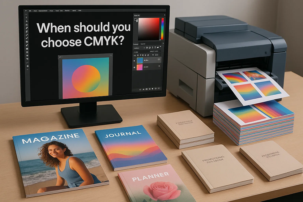
When should you choose CMYK?
CMYK is the versatile workhorse of printing. Here are scenarios where it excels:
Photographic or multi‑colour designs: For journals with full‑bleed images or planners featuring gradients and illustrations, CMYK’s four‑colour blending produces natural transitions. The metaltinpack guide notes that CMYK is “cost‑effective and efficient for creating real‑life pictures and text”metaltinpack.com.
Large or varied print runs: If you need hundreds of different notebook designs or frequently change artwork, CMYK allows the printer to queue jobs without cleaning the press printingsolutions.com. This reduces downtime and cost.
Budget‑sensitive projects: Because CMYK uses standard inks, there’s no charge for custom mixing. This makes it ideal for promotional notepads or affordable stationery lines.
Digital proofing and quick turnaround: CMYK files are easier to preview on-screen because the colour space is closer to what monitors display. Our team can send you quick digital proofs for approval.
If these points describe your project, CMYK is likely the best fit. Nonetheless, you might worry about colour shifts; if so, we’ll work with you to calibrate proofs and adjust ink percentages for your paper stock. Drop us a message to arrange a sample print.
When should you choose Pantone?
Pantone is the gold standard for colour fidelity. Consider spot colours in these situations:
Corporate branding and logos: Consistency across business cards, notebook covers, packaging and digital channels is critical. Pantone’s pre‑mixed inks ensure your brand colour always matches metaltinpack.com.
Vibrant or special colours: Metallic, neon, pastel and deep jewel tones often fall outside CMYK’s gamut noissue.co. Pantone can achieve these effects with spot inks.
Quality assurance requirements: Pantone enforces licensing and ink quality standards metaltinpack.com. If your brand must meet strict compliance, Pantone provides a controlled process.
High‑end stationery and limited colours: Premium planners or journals with minimal colours but high aesthetic demands benefit from spot colours. The extra investment enhances perceived value.
In these cases, Pantone’s higher upfront cost delivers long‑term benefits through brand consistency and rich colour. If you’re unsure whether Pantone is worth the investment, our sales consultants can evaluate your design and quantities. Feel free to reach out for a personalised consultation.
Combining Pantone colors vs CMYK
Many projects require both the precision of Pantone and the flexibility of CMYK.
For example, a branded notebook might use a Pantone spot colour for the logo and CMYK for a full‑colour photograph on the cover. This hybrid approach balances cost and quality. The metaltinpack article highlights that Pantone is great for spot colour applications, while CMYK is better for reproducing real‑life pictures and text metaltinpack.commetaltinpack.com. By assigning each element of your design to the most appropriate colour system, you can achieve faithful branding and vibrant imagery in one print run.
Conversion between colour spaces is sometimes necessary. The noissue article points out that it is possible to convert Pantone colours to CMYK and vice versa using online tools or Adobe Illustrator noissue.co. Metaltinpack recommends using a converter such as the one provided by Ginifab and switching colour modes in design software metaltinpack.com.
However, conversion is only an approximation because some Pantone colours can’t be reproduced accurately in CMYK metaltinpack.com. When converting, test your colours across different screens and printed proofs. The Graphic Design Stack Exchange advice suggests picking your Pantone colours first, then adjusting CMYK and RGB breakdowns while viewing the colours under realistic lighting conditions graphicdesign.stackexchange.com.

Practical guidelines for colour matching
Start with your brand colour palette: Select your Pantone spot colours in natural light graphicdesign.stackexchange.com. Look at swatches on coated and uncoated paper to understand how texture affects colour.
Test CMYK conversions: Use Pantone’s colour bridge guides or online converters to find the closest CMYK breakdowns. Adjust percentages if necessary; slight tweaks to low (1–3 %) or high (95–100 %) ink values improve printing graphicdesign.stackexchange.com.
Evaluate across mediums: Test your colours on different paper stocks and printing processes. The Stack Exchange answer recommends proofing across litho, digital and newsprint to select the best CMYK approximations graphicdesign.stackexchange.com.
Don’t overlook lighting and display differences: RGB colours on screens often appear brighter than printed colours. When translating Pantone to digital formats, pick hues that look good on multiple screens graphicdesign.stackexchange.com.
Consult professionals: Colour management is complex. Our team at Lion Paper Products uses calibrated monitors, proofing printers and years of experience to ensure your notebooks and planners meet colour expectations.

Industry considerations for stationery buyers
As a buyer in the writing paper and stationery industry, you must balance aesthetics, brand integrity, cost and production timelines. Here are a few industry‑specific tips:
Understand your audience: Stationery customers often look for beautiful colours that convey personality. Pantone allows you to choose unique hues that resonate with your brand, while CMYK is sufficient for everyday office supply lines. Selecting the right system helps you appeal to retailers and e‑commerce buyers.
Consider sustainable materials: Vibrant colours can look different on recycled or uncoated paper. Tests are essential. CMYK may absorb more into uncoated stock, making colours look dull. Pantone spot colours can maintain vibrancy, but extra coatings might be needed.
Manage inventory: If you plan multiple colour variations of a product, CMYK’s flexibility means you can run different designs together, reducing inventory risk. Pantone works best for timeless branded products with long shelf lives.
Align with global standards: The stationery market is international. Pantone ensures your brand colour looks the same in Shanghai and Los Angeles, which is crucial for global e‑commerce. Our factories in China, Cambodia and our partner facility in South Korea follow international certifications like ISO 9001 and FAMA. We can integrate Pantone colour management into your supply chain.

Feel free to discuss your target market with us; our experience in the US, UK, Germany and beyond can guide your decisions.Our R&D centre can test your colours on various environmentally friendly materials – just send us a brief.
Conclusion
Deciding between Pantone and CMYK is ultimately about your priorities: colour fidelity versus cost, vibrancy versus flexibility. CMYK is ideal for multi‑colour images, large print runs and budget‑friendly projects; Pantone shines when your brand colour must be exact or when you want metallic or neon effects metaltinpack.com.
A hybrid approach often delivers the best of both worlds. I hope this guide has demystified the choice and provided practical tools for your next notebook, planner or journal.
If you need assistance translating these insights into a specific order, please contact Lion Paper Products via our website or WhatsApp (+86 137 5075 6354). My team and I are dedicated to making your stationery both beautiful and consistent.
FAQs:
Q1: What is the main difference between Pantone and CMYK?
A: Pantone uses pre‑mixed spot inks for exact colour matches, while CMYK blends four process inks, which may result in slight colour variations.
Q2: When should I choose CMYK printing?
A:CMYK is ideal for multi‑colour artwork, photographs and large print. It’s cost‑effective and efficient for varied designs.
Q3: Why is Pantone more expensive?
A: Pantone uses a single‑print spot colour method where each colour is printed separately. Setup and cleaning make it costlier than CMYK.
Q4: Can CMYK reproduce all Pantone colours?
A: No. Standard CMYK can simulate about 55 % of Pantone colours. Adding extra inks (orange, green, violet) extends the gamut, but not all colours are possible.
Q5: Is Pantone better for logos?
A: Yes. Pantone ensures consistent brand colours across print runs and locations. It is widely used for corporate identity.
Q6: How do I convert Pantone to CMYK?
A: Use Pantone colour bridge guides or online converters; then adjust percentages and test prints.
Q7: Can I mix Pantone and CMYK in one project?
A: Yes. Use Pantone for logos or key colours and CMYK for photographs or backgrounds. This hybrid approach balances accuracy and cost.
Q8: Where can I get personalised advice on printing colours?
A: Lion Paper Products offers free consultations through our R&D centre. Contact us via our website or WhatsApp for tailored recommendations.
Are you looking for a reliable manufacturer? Reach out to Lion Paper for a free quote and consultation. Let’s collaborate on creating custom writing paper products that will set your brand apart from the competition!


Comments