

PANTONE Color Consistency in Notebook Cover Design
- Leo Xia

- May 21
- 22 min read

PANTONE Color Consistency in Notebook Cover Design means keeping a brand color visually stable across different notebook cover materials, finishes, and production batches. A PANTONE code alone does not guarantee the same final color. Coated paper, uncoated paper, kraft board, PU leather, fabric, matte lamination, gloss coating, embossing, and printing method can all change how the color looks. The best way to control PANTONE color is to choose the final cover material early, use the correct PANTONE C or U guide, make a physical proof on the real material, approve a golden sample, measure color with a spectrophotometer, and inspect samples under standard viewing conditions.
Quick Content Reach:
PANTONE Color Consistency in Notebook Cover Design
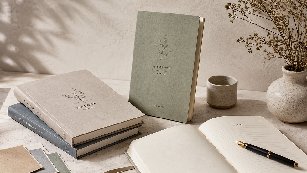
Notebook covers do more than protect pages. They carry a brand’s first impression.
A notebook used for a corporate gift, retail collection, conference kit, or premium stationery line must look right the moment someone picks it up. If the brand blue looks dull, the red looks too dark, or the green shifts after matte lamination, the whole product can feel less polished.
That is why PANTONE Color Consistency in Notebook Cover Design matters. It helps designers, buyers, and manufacturers speak the same color language before production starts.
But here’s the catch: a PANTONE number is not a magic button. It is a target. The final color depends on the full production system.
That system includes:
Color Factor | Why It Matters |
PANTONE code | Sets the target color |
Cover material | Changes absorption and reflection |
Ink formula | Affects strength and hue |
Printing method | Changes ink laydown |
Surface finish | Shifts brightness, depth, and texture |
Viewing light | Changes how the eye sees color |
Production control | Keeps repeat orders closer |
Pantone’s own support guidance explains that the same PANTONE color can look quite different on coated and uncoated paper because ink reacts differently with each surface. Coated paper allows less ink absorption, while uncoated paper absorbs more ink.
So, the goal is not to “trust the code and hope.” The goal is to build a clear color workflow from design to finished notebook.
What Is PANTONE Color?
PANTONE is a color matching system used by designers, printers, brands, and manufacturers to communicate color with more control.

Instead of saying “make this blue” or sending only a screen color, a designer can choose a specific PANTONE color. That gives the printer a shared reference.
The Pantone Formula Guide is one of the main tools used in print production. Pantone states that its Formula Guide displays 2,390 spot colors in the Pantone Graphics System on coated and uncoated paper stocks.
That last part is important: coated and uncoated paper stocks.
A color is not judged in the air. It is judged on a surface. For notebook covers, that surface may be smooth coated paper, rough recycled board, kraft paper, PU leather, cloth, or a laminated sheet.
PANTONE as a Color Standard
A PANTONE code gives everyone a shared target.
For example, a brand may say:
Brand Element | Color Standard |
Main logo | PANTONE 186 C |
Secondary color | PANTONE 7546 C |
Accent color | PANTONE 1235 C |
Notebook cover finish | Matte lamination |
This is much clearer than sending only a JPEG or a screenshot. Screens use light. Printing uses ink. They are not the same.
The International Color Consortium, known as ICC, maintains specifications for color management profiles. ICC describes its work as promoting an open color management system, and its current specifications support color communication across devices and workflows.
For notebook design, this means digital files should use proper profiles, but the final decision should still be made with physical samples.
Why Brands Use PANTONE Colors
Brands use PANTONE colors because color builds memory.
A notebook cover may appear in:
Retail stores
Corporate gifting campaigns
University bookstores
Trade shows
Subscription boxes
Welcome kits
Brand merchandise shops
If the same brand color changes from order to order, the product loses trust. A notebook may still function well, but the brand feels less consistent.
PANTONE helps reduce that risk. It gives the design team, supplier, ink maker, and print operator a shared starting point.
Still, a shared starting point is not the same as a guaranteed result.
PANTONE vs CMYK vs RGB
This is where many color problems begin.

Color System | Used For | Main Risk |
RGB | Screens, websites, digital mockups | Bright screen colors may not print the same |
CMYK | Process printing | Some PANTONE spot colors cannot be matched exactly |
PANTONE | Spot color matching | Final result still depends on material and finish |
Pantone’s Color Bridge Guide is made to show side-by-side comparisons between PANTONE spot colors and their closest CMYK, RGB, and HTML values. It is printed on coated and uncoated paper stocks, which helps designers understand that the same color changes by surface and printing condition.
For notebook covers, this is a key lesson. A nice RGB mockup is useful for presentation, but it should not be the final color approval.
Why Notebook Cover Colors Change
Notebook covers are tricky because they are made with many materials and finishes.
A simple softcover notebook may use printed paperboard. A premium journal may use PU leather, fabric, foil, debossing, edge painting, or soft-touch lamination. Each choice changes the final look.
A PANTONE color can change because of three main reasons:
The material absorbs ink differently.
The surface reflects light differently.
The finish changes how the eye sees brightness and depth.

Material Affects Color
Notebook cover material is often the biggest color variable.
A smooth white coated cover can make colors look clean and bright. A kraft paper cover can make the same color look warmer, darker, or more earthy. A textured stock can soften sharp details and reduce brightness.
Here is a simple example:
Same Target Color | Likely Visual Result |
On coated white paper | Brighter and cleaner |
On uncoated paper | Softer and more muted |
On kraft paper | Warmer and darker |
On textured paper | Less sharp, more natural |
On PU leather | Depends on coating and surface grain |
Under matte lamination | Softer and lower in shine |
Under gloss lamination | Brighter and more reflective |
This is why material approval should come before color approval.
If a buyer approves a PANTONE color on coated paper, then later changes the notebook cover to kraft, the approved color may no longer be realistic.
Ink Absorption Changes Results
Ink behavior is not the same on every surface.
Pantone explains that coated paper has a shiny surface, so the ink sits more on top and has minimal absorption. Uncoated paper has no surface coating, so it absorbs more ink. This creates a different visual appearance even for the same PANTONE color.
For notebook covers, this matters a lot.
An ink that looks rich on coated stock may look flat on uncoated stock. A dark green may lose depth on rough paper. A bright orange may become dusty on kraft board.
The ink formula may need to be adjusted for the chosen material.
Surface Finish Shifts Appearance
Finishing can change the final color after printing.
This is often a surprise for buyers. A sample may look perfect before lamination. Then the final notebook looks slightly different after coating.
Common finish effects include:
Finish | Common Color Effect |
Matte lamination | Softer, less reflective |
Gloss lamination | Brighter, deeper, more shiny |
Soft-touch coating | Smooth, premium, often slightly muted |
Embossing | Creates highlights and shadows |
Debossing | Creates depth and darker-looking areas |
Foil stamping | Replaces ink with metallic reflection |
This does not mean one finish is better than another. It means the finish must be part of the color approval process.
Common Notebook Cover Materials
Different notebook cover materials need different color expectations.
A good manufacturer should not treat all cover surfaces the same. A good designer should not expect one PANTONE code to look identical across all surfaces without testing.
Coated Paper Covers
Coated paper is often used for colorful notebook covers, retail notebooks, and promotional stationery.

It usually gives a cleaner and brighter result because the ink sits closer to the surface. That makes coated paper a strong choice when the design needs sharp images, strong contrast, and vivid colors.
Best for:
Bright brand colors
Full-cover artwork
Retail designs
Logo-heavy covers
Clean corporate notebooks
Color risk: gloss or matte coating after printing can still shift the final appearance.
Uncoated Paper Covers
Uncoated paper has a more natural feel. It is popular for eco-style notebooks, minimalist brands, sketchbooks, and premium stationery.
The color often looks softer because the paper absorbs more ink. Pantone’s coated vs uncoated guidance supports this point, noting that the same PANTONE color can have a different look due to the ink-paper reaction.
Best for:
Natural brand styles
Writing journals
Eco notebooks
Soft-touch brand identities
Minimal cover designs
Color risk: bright colors may look less vivid than expected.
Kraft Paper Covers
Kraft paper gives a warm and earthy look. It works well for sustainable notebook lines and handmade-style stationery.

But kraft is not white. That changes everything.
A blue printed on kraft may look greener or duller. A red may look brownish. A yellow may lose brightness. Light colors may almost disappear unless white ink or another base layer is used.
Best for:
Eco-friendly notebooks
Recycled stationery
Organic brand styles
Simple black or dark ink designs
Color risk: brand colors can shift strongly because the base material is brown.
PU Leather Covers
PU leather is common for corporate notebooks, planners, diaries, and premium journals.

Color matching on PU leather is different from paper printing. The surface may be smooth, grained, glossy, matte, or coated. Logos may be applied with foil stamping, screen printing, UV printing, debossing, or embossing.
Best for:
Executive notebooks
Luxury journals
Corporate gifts
Debossed logos
Foil-stamped branding
Color risk: exact PANTONE matching may be harder, especially when the color is applied by foil, coating, or pre-colored PU material rather than standard ink.
Fabric and Textured Covers
Fabric covers feel warm and premium, but they are not the easiest choice for tight color matching.

Fabric texture scatters light. It can make colors look softer and less even. Fine details may also lose sharpness.
Best for:
Premium journals
Lifestyle brands
Gift notebooks
Bookcloth covers
Handmade-style collections
Color risk: texture and weave can change both color and logo clarity.
PANTONE C vs PANTONE U
PANTONE C and PANTONE U are not random letters.

They refer to how the color appears on different paper types:
Code | Meaning | Common Use |
PANTONE C | Coated | Glossy or coated paper stocks |
PANTONE U | Uncoated | Matte, absorbent, or uncoated stocks |
Pantone’s official guide separates coated and uncoated paper because the same color can look different on each.
For notebook covers, this choice should match the real cover material as closely as possible.
What PANTONE C Means
PANTONE C is used for coated paper.
Choose PANTONE C when the notebook cover will be printed on coated stock or a smooth surface that keeps ink near the top.
It is often the right choice for:
Glossy covers
Coated art paper
Full-color retail notebooks
Smooth laminated covers
Bright brand colors
Still, it is wise to proof the color after the final lamination or coating.
What PANTONE U Means
PANTONE U is used for uncoated paper.
Choose PANTONE U when the cover is made with uncoated stock, natural paper, recycled board, or absorbent paper.
It is often better for:
Matte paper covers
Recycled notebooks
Natural stationery
Textured cover stock
Minimalist journal covers
PANTONE U can help set a more realistic expectation for how the color will look on absorbent paper.
Which One to Choose
The simple rule is this:
Choose the PANTONE guide that is closest to the final cover surface.
If the cover is coated, start with PANTONE C.If the cover is uncoated, start with PANTONE U.If the cover is kraft, PU leather, fabric, or specialty material, do not rely on the guide alone. Make a physical proof.
This is the safest route for PANTONE Color Consistency in Notebook Cover Design.
How Printing Methods Affect Color
The printing method also changes the final result.
A notebook cover may be printed by offset, digital, screen printing, UV printing, or specialty decoration. Each method lays down ink in a different way.
Offset Printing
Offset printing is common for larger notebook runs.
It is a good choice when the order needs stable color, sharp details, and cost efficiency at volume. It also works well with spot colors when the job is planned correctly.
ISO 12647-2 is a key standard for offset lithographic processes. ISO describes it as a process control standard for half-tone color separations, proofs, and production prints in offset printing.
For notebook suppliers, referring to ISO 12647-2 shows that the print process is being managed with recognized production controls.
Digital Printing
Digital printing is useful for short runs, samples, and fast custom notebook orders.
It is flexible, but PANTONE matching may depend on the machine, toner or ink system, RIP settings, paper, and calibration. Some digital printers simulate PANTONE colors using CMYK or extended ink sets.
This can be good enough for many projects. But for strict brand colors, a physical sample is still needed.
Screen Printing
Screen printing is often used for simple logos on PU leather, cloth, plastic, and specialty covers.
It can create solid color areas with strong opacity. But it may not match a PANTONE guide automatically. The ink must be mixed and tested for the surface.
Screen printing works well for:
One-color logos
Fabric covers
PU leather covers
Dark cover materials
Simple graphic marks
The key is to approve the ink on the real cover material.
Foil Stamping
Foil stamping is not the same as printing with ink.
A metallic gold, silver, copper, or holographic foil reflects light. Even when a foil is chosen to match a brand color, it will not behave like flat ink.
Foil is best used when shine and premium feel matter more than exact color matching.
For strict brand systems, define foil as a separate brand finish, not as a direct replacement for a PANTONE ink.
How Finishes Change Color
Finishing is where many notebook color surprises happen.
A printed sheet can look approved. Then the final notebook changes after matte film, gloss film, soft-touch coating, or embossing.
That does not mean the printer made a mistake. It means the finish became part of the color.
Matte Lamination
Matte lamination gives a calm, premium look. It reduces glare and makes the cover feel more refined.
But it can also make colors look softer. Strong reds may feel less bright. Deep blues may look calmer. Black may look less sharp than gloss black.
Best practice: approve color after matte lamination, not before it.
Gloss Lamination
Gloss lamination increases reflection. It often makes colors appear brighter and deeper.
This can be great for retail notebooks, kids’ stationery, travel journals, and bold designs.
But gloss can also create glare. Under strong light, the reflection may make the color harder to judge.
Best practice: compare gloss samples under controlled light.
Soft-Touch Coating
Soft-touch coating feels smooth and premium. It is popular for luxury notebooks and business gifts.
The color may look slightly muted because the surface reduces harsh reflection.
Best practice: test dark colors carefully. Fingerprints and scuffs may show more on some soft-touch finishes.
Embossing and Debossing
Embossing raises part of the cover. Debossing presses it down.
Both create light and shadow. That can make the same color look lighter or darker in different areas.
For logos, this may look elegant. For full-color brand matching, it adds another variable.
Best practice: approve the logo color and the raised or pressed effect together.
Main Causes of Color Difference
Most notebook cover color problems come from avoidable steps.
The issue is rarely “Pantone does not work.” More often, the issue is that the production workflow did not control the material, proof, finish, or viewing condition.
Wrong Material Choice
A brand may choose a color based on a smooth PANTONE guide, then print it on rough recycled paper.
The final color looks different because the material is different.
This is not a small detail. The material is part of the color system.
No Physical Proof
A digital mockup is useful, but it cannot show true print color.
Even a calibrated monitor uses light. A notebook cover uses ink, material, coating, and texture.
A physical proof helps everyone see what will actually be produced.
Screen-Based Approval
Many color problems start with this sentence:
“It looked right on my screen.”
That is not enough.
Screens vary by brightness, profile, age, and viewing environment. ICC profiles help manage color across devices, but print approval still needs a physical reference. ICC’s specifications support profile-based color management, but the printed sample must still be checked in the real workflow.
Changing Materials Later
If the cover material changes after color approval, the color approval should be repeated.
This includes changes such as:
Coated paper to uncoated paper
White board to kraft board
Matte lamination to soft-touch coating
Paper cover to PU leather
Smooth stock to textured stock
A new surface means a new color result.
Different Production Batches
Even when the same file and same PANTONE code are used, batches can vary.
Possible causes include:
Different paper lots
Different ink batches
Press setting changes
Different humidity conditions
Different coating suppliers
Operator adjustments
Poor sample storage
This is why repeat orders need a golden sample and written color standard.
How to Control PANTONE Color
The best color control is simple, but it must be done early.
Do not wait until mass production to discuss color. By then, fixes are expensive.
Use this workflow:
Step | Action | Result |
1 | Confirm the PANTONE code | Everyone shares the same target |
2 | Choose the final cover material | Color is judged on the right surface |
3 | Select the print method | Ink behavior is more predictable |
4 | Test the final finish | Lamination or coating is included |
5 | Make a physical proof | The team sees the real result |
6 | Approve a golden sample | Production has a reference |
7 | Measure and inspect | Quality is controlled by data and eyes |
X-Rite, a major color measurement company, notes that print and packaging color quality control can be improved with color measurement tools and spectrophotometers for consistent results across jobs.
Confirm the PANTONE Code
Start with the exact PANTONE code.
Do not send only:
A screenshot
A JPG file
A Canva mockup
A CMYK build
A color name like “royal blue”
Send a clear specification:
Item | Example |
Brand color | PANTONE 286 C |
Use area | Front cover background |
Material | 157 gsm coated art paper over greyboard |
Finish | Matte lamination |
Print method | Offset printing |
Tolerance | To be confirmed by approved proof |
Approval sample | Physical golden sample required |
This removes guesswork.
Choose the Final Material Early
Material must be chosen before final color approval.
If a brand is deciding between coated paper, kraft paper, and PU leather, each option should be tested separately.
Do not approve color on one material and produce on another.
Make a Physical Proof
A proof should be made on the final or closest possible material.
For strict brand color, ask for:
Material swatch
Ink drawdown
Printed proof
Lamination proof
Finished notebook mockup
A flat proof is helpful. A finished notebook sample is better because it includes the real cover structure, texture, lamination, folding, binding, and handling.
Approve a Golden Sample
A golden sample is the approved physical sample used as the production reference.
It should be signed, dated, stored safely, and used for future reorders.
A good golden sample includes:
Detail | Why It Matters |
PANTONE code | Sets the color target |
Material name | Controls the surface |
Finish type | Controls final appearance |
Production date | Tracks batch history |
Supplier name | Supports repeat orders |
Approval signature | Avoids disputes |
Storage notes | Protects against fading |
For repeat notebook orders, this sample is often more useful than a digital file alone.
Keep Quality Records
Color control needs records.
A professional supplier should be able to keep:
Approved artwork
PANTONE references
Material lot information
Ink formula notes
Press settings
Proof approval records
Spectrophotometer readings
Final QC photos
Golden sample archive
This builds trust and reduces repeat-order risk.
Color Proofing for Notebook Covers
Proofing is not an extra step. It is a risk control step.
It protects the brand, the buyer, and the manufacturer.
Why Proofing Is Important
Proofing catches color issues before mass production.
It can reveal:
A color is too dark on kraft
A logo is weak on fabric
A matte film makes red look dull
A foil is too shiny for the brand
A screen print needs more opacity
A CMYK simulation cannot match the spot color closely
A proof does not slow the project down. It saves time by reducing rework.
Digital Proof vs Physical Proof
Digital proofs are good for layout, spelling, size, and placement.
Physical proofs are needed for color, texture, finish, and touch.
Proof Type | Best For | Not Best For |
PDF proof | Layout and text check | Final color approval |
Screen mockup | Presentation | Print accuracy |
Printed proof | Color review | Full texture if wrong material |
Material proof | Surface behavior | Full product feel |
Finished sample | Final approval | Fastest timeline |
For brand notebooks, the finished sample is the strongest approval tool.
Material-Based Proofing
A material-based proof means the color is tested on the actual cover material.
This is especially important for:
Kraft covers
PU leather covers
Fabric covers
Textured paper covers
Soft-touch covers
Foil-stamped covers
Embossed or debossed covers
The goal is simple: approve what will actually be produced.
Using a Golden Sample
A golden sample turns opinion into a shared reference.
Instead of saying “the color looks a bit off,” the team can compare the new batch with the approved sample.
This is useful for both visual checks and machine readings.
What a Golden Sample Is
A golden sample is the master sample.
It is the approved physical notebook or cover sheet that defines the expected result.
It should represent:
Correct color
Correct material
Correct finish
Correct logo position
Correct binding style
Correct final feel
For notebook production, a golden sample should not be replaced by a photo. Photos change by camera, lighting, and screen.
Why It Matters for Reorders
Reorders often happen months later.
By then, the original production team may have changed. The paper lot may be different. The ink batch may be different. The press conditions may be different.
A golden sample gives the supplier a real target.
It also helps the buyer judge whether the new batch is close enough.
How to Store Approved Samples
Store golden samples in a clean, dry, dark place.
Avoid:
Direct sunlight
High humidity
Heat
Dust
Strong pressure
Chemical exposure
Color can fade or shift over time. If possible, store two samples: one for daily reference and one sealed backup.
Color Tolerance in Production
Perfect color matching is hard. Controlled color matching is possible.
Color tolerance defines how much difference is acceptable between the target and the production sample.
What Color Tolerance Means
Color tolerance is the allowed difference between two color samples.
In print production, this may be judged by:
Human eyes
Spectrophotometer readings
Delta E values
Customer-approved samples
Industry standards
Brand-specific rules
For many notebook projects, visual approval plus a measured record is the safest approach.
Understanding Delta E
Delta E, often written as ΔE, is a way to describe color difference.
The CIEDE2000 formula is one modern method for measuring perceived color difference. The International Commission on Illumination says CIEDE2000 extends earlier color-difference formulas by correcting for lightness, chroma, hue, and chroma-hue interaction.
In simple terms:
Delta E Idea | Meaning |
Lower number | Closer color match |
Higher number | Larger color difference |
Measured value | Useful for QC records |
Visual check | Still needed for final judgment |
Do not use Delta E as the only decision tool for textured, metallic, kraft, or highly finished covers. The eye still matters.
Visual Check vs Machine Check
Machines are good at measuring. People are good at judging the full product experience.
Use both.
A spectrophotometer can check color data. A trained person can judge the cover under standard light, compare it with the golden sample, and notice finish-related issues.
ISO 3664:2025 specifies viewing conditions for images on reflective and transmissive media, including prints, and applies to critical evaluation and comparison of printed images or reference objects.
That matters because a notebook cover can look different under office light, daylight, warehouse light, and trade show lighting.
Designer Checklist
Designers can prevent many color problems before the file goes to production.
Checkpoint | Good Practice |
PANTONE code | Use exact C or U code |
Artwork file | Provide editable vector files |
Color mode | Use proper print settings |
Material note | Mark the final cover material |
Finish note | Include matte, gloss, foil, or embossing |
Logo usage | Define size, position, and clear space |
Proof request | Ask for a physical proof |
Approval | Do not approve color only on screen |
A designer’s job is not only to create a beautiful cover. It is to make that cover producible.
Use the Right PANTONE Code
Check whether the project needs PANTONE C or PANTONE U.
Do not mix codes without reason.
If the brand guide only gives RGB or HEX values, ask whether a print color standard exists. If not, create one before mass production.
Mark Materials Clearly
Do not write “premium cover” in the file note.
Write the real material, such as:
157 gsm coated art paper
120 gsm uncoated paper
2 mm greyboard wrapped with printed paper
Recycled kraft paper cover
PU leather cover with debossed logo
Bookcloth cover with screen-printed logo
Clear material notes reduce mistakes.
Include Finish Instructions
Finishes should be written into the artwork and production brief.
For example:
Finish | File Note Example |
Matte lamination | Full cover matte lamination after printing |
Gloss UV | Spot UV on logo only |
Foil stamping | Gold foil logo, centered |
Debossing | Blind deboss logo, no ink |
Soft-touch | Soft-touch film on full front cover |
A finish is not decoration only. It affects color and touch.
Buyer Checklist
Buyers are often the bridge between the brand and the factory.
A good buyer asks the right questions before production starts.
Question | Why It Matters |
Can we see the material first? | Material changes color |
Is this PANTONE C or U? | Guide choice matters |
Will there be lamination? | Finish changes color |
Can we approve a physical proof? | Prevents surprises |
Can you keep a golden sample? | Helps repeat orders |
Do you measure color? | Adds QC control |
What standard do you follow? | Shows process maturity |
A low-cost notebook can become expensive if the color is wrong and the batch must be remade.
Ask for Material Samples
Before artwork approval, ask for real cover material samples.
Touch them. Look at them. Compare them under good light.
Do not choose kraft, fabric, or PU leather only from a catalog photo.
Confirm the Final Finish
Ask this before proofing:
“Will the proof include the same finish as the final notebook?”
If the answer is no, the proof may not show the final color.
For strict brand color, the proof should include the final finish.
Save the Approved Sample
Buyers should keep their own approved golden sample.
Do not leave the only approved sample with the factory. Both sides should have one.
This makes future communication easier.
Manufacturer Checklist
A professional notebook manufacturer should have a clear color workflow.
Area | What to Control |
Prepress | File setup, PANTONE code, ICC profile |
Material | Paper lot, surface, whiteness, texture |
Ink | Formula, batch, opacity |
Press | Density, registration, speed, drying |
Finish | Lamination, coating, foil, pressure |
QC | Visual check, measurement, records |
Storage | Golden sample, production data |
X-Rite highlights the role of color measurement tools in improving print and packaging quality control across jobs.
Match Ink to Material
The same ink may not work equally well on every cover material.
For difficult materials, the ink supplier may need to adjust:
Ink strength
Opacity
Drying behavior
Adhesion
Viscosity
Surface compatibility
This is why drawdowns and material proofs matter.
Control Press Conditions
For offset notebook covers, ISO 12647-2 is a useful process control reference. It covers production parameters for offset lithographic processes, including proofs and production prints.
For a buyer, the exact technical details may not matter. What matters is whether the printer follows a stable and repeatable process.
Record Color Standards
Good manufacturers keep records.
Better manufacturers can show them.
Look for:
Spectrophotometer logs
Color tolerance notes
Ink batch records
Press sheets
Approved samples
QC reports
Reorder history
This gives buyers more confidence.
Professional Credibility Signals
To build trust, notebook suppliers and print partners should show proof of process quality.
They should not only say, “We can match PANTONE.”
They should show how.
Useful credibility signals include:
Signal | What It Shows |
G7+ certification or trained expert | Strong color calibration process |
ISO 12647-2 workflow | Offset print process control |
Fogra PSO certification | Reliable offset print production |
ISO 3664 viewing setup | Standardized color viewing |
Spectrophotometer use | Measured color control |
Golden sample system | Repeat-order consistency |
Written QC reports | Traceable quality process |
PRINTING United Alliance describes G7+ certification as an industry-recognized path for optimized print output and color consistency across print technologies, substrates, and applications.
Fogra also states that ProcessStandard Offset and the ISO 12647 series are important tools for color-reliable print production.
These signals are helpful for brand buyers. They show that the supplier has a process, not just a promise.
Example: One Color, Different Covers
Let’s say a brand wants to use one deep red for four notebook covers.
The target is the same. The results may not be.
Cover Type | Expected Result | Best Control Step |
Coated paper cover | Bright and clean red | Use PANTONE C proof |
Uncoated cover | Softer red | Use PANTONE U proof |
Kraft cover | Darker, warmer red | Test ink or white base |
Matte laminated cover | Slightly muted red | Approve after lamination |
PU leather cover | Depends on surface | Make a real material sample |
This is why “same PANTONE, same result” is not a safe rule.
The safer rule is:
Same PANTONE + same material + same finish + same process = better consistency.
Common Mistakes to Avoid
Most notebook color mistakes can be avoided with planning.
Using Only RGB Files
RGB is for screens.
If a supplier receives only an RGB file, they must convert the color for print. That conversion may not match the brand color.
Send PANTONE values and print-ready files.
Ignoring Cover Texture
Texture changes color.
A rough cover scatters light. A smooth cover reflects light more evenly. Fabric, kraft, and leather-like surfaces all change how the eye reads the color.
Always test color on textured materials.
Skipping the Proof Stage
Skipping proofing may save time at the start. It can cost more later.
A proof can catch problems before thousands of notebooks are produced.
For brand orders, proofing is not optional. It is insurance.
Expecting Exact Matches on All Materials
A PANTONE color may not look identical on coated paper, kraft, PU leather, and fabric.
The goal is not always exact sameness. Sometimes the goal is a controlled brand family.
That means each material version looks intentional, balanced, and close enough for the product line.
Best Practice Table for Notebook Color Control
Stage | Best Practice | Why It Helps |
Design | Choose PANTONE C or U | Sets a clear color target |
Material | Approve final cover stock early | Avoids late color shifts |
Prepress | Use correct color profiles | Reduces conversion errors |
Proofing | Make a physical proof | Shows real color behavior |
Finishing | Proof after lamination or coating | Shows final appearance |
Approval | Sign a golden sample | Creates a shared reference |
QC | Measure and inspect | Combines data with human judgment |
Reorder | Compare with stored sample | Keeps future batches closer |
This workflow is simple, but it works.
Conclusion
PANTONE is a strong color language, but it is not the whole story.
Notebook cover color depends on the PANTONE target, the cover material, the ink, the printing method, the finish, the lighting, and the production controls. A coated paper cover, kraft cover, PU leather journal, and fabric notebook can all use the same PANTONE reference and still look different.
The best approach is clear and practical:
Choose the right PANTONE guide.
Confirm the final material early.
Make a physical proof.
Approve a golden sample.
Measure color when needed.
Check the final notebook under standard light.
That is how brands get closer to reliable, repeatable, and professional notebook cover color.
For any custom notebook project, remember this simple rule:
PANTONE sets the target. The material, finish, and process decide the final look.
—Leo Xia, CEO, Lion Paper Products
You design, we deliver.
FAQs:
Q1: Can the same PANTONE color look different on different notebook covers?
Yes. The same PANTONE color can look different on coated paper, uncoated paper, kraft paper, PU leather, fabric, and textured cover stock. Pantone states that coated and uncoated paper can create different visual results because ink reacts differently with each paper surface.
Q2: Should I use PANTONE C or PANTONE U for notebook covers?
Use PANTONE C for coated or smoother paper covers. Use PANTONE U for uncoated or absorbent paper covers. For kraft, PU leather, fabric, or specialty covers, use the guide as a starting point, then approve a real material proof.
Q3: Does matte lamination affect PANTONE color?
Yes. Matte lamination can make colors look softer and less reflective. It may reduce the visual brightness of strong colors. Always approve the color after matte lamination if that is the final finish.
Q4: Why does my notebook cover color look different from my screen?
Screens use RGB light. Printed notebook covers use ink, material, and surface reflection. A screen preview is useful for layout, but it should not be used as the final color approval. Use a printed proof or finished sample instead.
Q5: Is a physical proof necessary before mass production?
Yes, especially for brand colors, kraft covers, PU leather covers, fabric covers, matte lamination, foil stamping, or premium notebook projects. A physical proof shows how the color behaves on the real material.
Q6: What is a golden sample in notebook production?
A golden sample is the approved physical sample used as the color and quality reference for mass production and future reorders. It should include the correct material, color, finish, logo, and notebook structure.
Q7: How can I match repeat notebook orders?
Keep a golden sample, use the same material specification, record the PANTONE code, keep ink and production notes, and compare each new batch under standard viewing conditions. A spectrophotometer can also help record and compare color data.
Q8: What certifications should a notebook supplier have for color control?
Useful signals include G7+ certification, Fogra PSO certification, ISO 12647-2-based offset print control, ISO 3664 viewing conditions, spectrophotometer-based QC, and written color reports. These show that the supplier has a repeatable color process.
Reference
https://www.pantone.com/products/graphics/formula-guide-coated-uncoated
https://www.pantone.com/products/graphics/color-bridge-guide-set-coated-uncoated
https://www.xrite.com/blog/color-measurement-tools-for-print-consistency
https://www.cie.co.at/publications/colorimetry-part-6-ciede2000-colour-difference-formula
https://www.printing.org/library/technical-excellence/certifications/g7plus
Are you looking for a reliable manufacturer? Reach out to Lion Paper for a free quote and consultation. Let’s collaborate on creating custom writing paper products that will set your brand apart from the competition!
About Lion Paper
Company Name: Lion Paper Products
Office Address: 20th floor, Chuangyedasha Building, No. 135, Jinsui Road, Jiaxing City, Zhejiang Province, China
Factory Address: No.135, Xuri Road, Jiaxing City, Zhejiang, China
Email: Leoxia@lion-paper.com
Audit Certifications: ISO9001:2015/FSC/SEDEX SMETA/Disney FAMA/GSV/SQP

Comments