

CMYK and RGB for Notebook Printing: The Guide for Buyers
- Leo Xia

- Oct 30, 2025
- 9 min read
In notebook printing, the choice of color mode can make or break your project. CMYK vs RGB for Notebook Printing behave differently: one adds light and the other subtracts it. RGB is ideal for digital design, while CMYK produces accurate printed colours. If you’ve ever wondered why the colours on your screen don’t match your printed notebook, this guide explains why and shows you how to get it right.
Quick Content Reach:
Why colour modes matter for notebook printing
Group buyers often design notebooks and planners on computers, then send the files to factories like Lion Paper for mass production. Digital screens use red, green and blue light to mix colours (RGB), producing millions of vibrant hues. Printing presses, however, rely on cyan, magenta, yellow and key (black) inks (CMYK) to absorb light and create colour on paper. This fundamental difference means your design can look perfect on a monitor but appear dull or distorted when printed. Understanding both colour models helps buyers set expectations, choose the right file formats and maintain brand consistency across thousands of notebooks.

Ready to lock brand colours across bulk runs? Email Leoxia@lion-paper.com or WhatsApp +86 137 5075 6354 to get a print-readiness check and paper samples.
Understanding RGB: the additive model
What is RGB?
RGB stands for Red, Green and Blue. Digital screens mix these three colours of light to create up to 16.7 million colours. Each pixel on a monitor or phone contains tiny red, green and blue lamps. When you turn them all up (255 each), you see white; when you turn them all off, you see black. Because the colours are produced by adding light, RGB is called an “additive” colour model. It’s best suited for on‑screen elements such as web graphics, app interfaces, digital photos and social media assets.
Why is RGB not ideal for printing notebooks?
Although RGB displays can show a wide colour gamut, printing presses cannot reproduce all those hues. When you send an RGB image to a printer, the press software must convert the colours to CMYK. That conversion often leads to unpredictable shifts—particularly in very bright or saturated areas—because some RGB colours fall outside the printable range. For example, neon greens and oranges can appear muted when printed. If buyers design notebooks exclusively in RGB, they might be surprised when their brand colours look dull in the final product.

Understanding CMYK: the subtractive model
What is CMYK?
CMYK stands for Cyan, Magenta, Yellow and Key (black). Unlike RGB, which adds light, CMYK works by subtracting light. Each ink layer on paper acts like a filter: cyan ink absorbs red light, magenta absorbs green, yellow absorbs blue and black absorbs all colours. When more ink is applied, less light reflects off the paper, making the colour darker. Because paper doesn’t emit light, CMYK has a narrower colour gamut than RGB.
Why CMYK is used for notebook printing
Printing presses are calibrated for CMYK because it produces predictable, consistent results. Professional printers—especially high‑end digital presses—use CMYK colour wheels to create rich blacks and accurate hues. Some presses also support additional spot colours (Pantone inks) to expand the gamut, but CMYK remains the base. When group buyers prepare their artwork in CMYK, they reduce the risk of unexpected colour shifts during production. Proper CMYK files also enable printers to estimate ink coverage and control costs more accurately.

Not sure if a hue will shift in print? Request a soft-proof + hard-proof quote for your cover and insert pages: WhatsApp +86 137 5075 6354.
Key differences between CMYK and RGB for notebook printing
Colour mixing and gamut
In the RGB model, mixing more light produces brighter colours; mixing red, green and blue at full intensity yields white . In CMYK, mixing more ink absorbs more light and thus creates darker shade. RGB can display a broader spectrum of hues than CMYK, but CMYK can produce some colours—such as deep blacks and certain pastels—that RGB struggles to render. This difference means designs created in RGB may contain colours that cannot be reproduced exactly on paper.
Application: digital vs physical products
RGB is ideal for digital media like websites, videos and social posts. CMYK is mandatory for physical items such as notebooks, planners, brochures and packaging. Using the wrong mode can lead to disappointing prints or inefficient file sizes. For example, JPEGs and PNGs work well for RGB images, while PDFs and TIFFs preserve CMYK colour profiles for printing.

File formats and design tools
RGB files are commonly saved as JPEG, PNG, GIF or SVG. These formats balance quality and file size for digital use but may strip out necessary print data. CMYK files are often delivered as PDF, TIFF, EPS or Adobe Illustrator (AI) formats. These formats preserve vector paths, layers and colour profiles, ensuring that printers can separate the inks correctly. When designing, set your software’s colour mode to CMYK for print projects or convert before exporting.
Colour accuracy and predictability
Because RGB screens emit light, colours appear more vibrant and saturated. CMYK prints rely on reflected light, so colours can look flatter. Printify notes that CMYK colours may appear less vibrant than RGB due to differences in ink coverage and paper substrates. VistaPrint recommends using variations of black ink (such as Cool Black or Warm Black) and controlling ink percentages to avoid smudging. Understanding these nuances helps buyers adjust their designs to achieve the desired effect.
When should notebook buyers use RGB?
Designers often start their ideas in RGB because screens handle it natively. Use RGB when creating digital mockups, animations or e‑commerce images that will appear on websites and social media. If your team needs to share concept art with stakeholders via email or presentations, RGB files will look vibrant on monitors. However, convert those files to CMYK before sending them to a printer to ensure accurate output.
Why CMYK is the standard for notebook printing
When producing thousands of notebooks, colour consistency is critical. CMYK printing offers control over ink densities, dot patterns and registration marks. By adjusting the percentage of each ink, printers can reproduce subtle brand hues, gradients and photographic images. High‑end printers also employ colour management modules (CMMs) that translate RGB values into CMYK profiles. Without proper conversion, cheap desktop printers may misinterpret colours, leading to inconsistent results across different devices. Working in CMYK from the start ensures your notebooks look the way you expect across all print runs.

Scale with confidence. Book a 15-minute production consult to review ink limits, blacks, and coverage targets!
Converting RGB files to CMYK: best practices
Convert early in the design process
Print experts recommend designing in CMYK from the outset, or converting your RGB artwork to CMYK before finalising your files conquestgraphics.com. Early conversion helps you identify colours that shift or dull when printed, allowing you to adjust them proactively. Software like Adobe Photoshop and Illustrator allow you to set your document’s colour mode at creation or convert via the “Edit → Convert to Profile” function. Once converted, inspect your design and tweak any colours that look off.
Use colour profiles and proofing tools
Colour profiles define how devices interpret colour. Printers may provide ICC profiles specific to their machines and papers; load these into your design software for accurate simulation. Soft proofing lets you preview how RGB colours will translate to CMYK on your monitor. If possible, order printed proofs or sample notebooks to see the actual results. Sampling helps detect issues with saturation, contrast and paper stock before committing to a full production run.
Calibrate your monitor
Because colour perception is subjective and influenced by ambient light, calibrate your monitor to industry standards (e.g., D65 white point and 120 cd/m² brightness). Calibration tools measure your display’s colour response and adjust it to match printed output. This step reduces discrepancies between what you see on screen and what appears on paper. Pair calibration with consistent viewing conditions to improve accuracy.

Want to discover how precise color can enhance your notebook collection? Get in touch with us today to request samples or discuss your needs.
Impact of colour mode on notebook design and brand identity
Brand colours are central to corporate identity. If a notebook’s cover or page accents deviate from official colours, the end product can undermine brand recognition. Because RGB provides a broader gamut, designers often pick vibrant hues that cannot be reproduced in CMYK. As a result, printed notebooks may look muted or misaligned with the brand palette. To avoid this, choose colours that fall within the CMYK gamut or specify spot colours (Pantone) for critical elements. Pantone inks can be used alongside CMYK to achieve precise branding, though they may increase cost.

Paper type also affects colour. Coated papers reflect light more evenly, producing sharper images, while uncoated papers absorb ink and soften colours. If your notebooks use recycled or tinted paper, expect more variation in hue and contrast. Discuss these factors with your supplier and request paper samples. Lion Paper’s quality‑testing team evaluates materials annually, including compliance with California Proposition 65 and CPSIA certifications, to ensure they meet safety and performance standards.
Discover how accurate color can elevate your notebook range. Contact us today for samples or to discuss your needs.
Colour management and printer technology
Modern printing presses use sophisticated colour management systems to maintain consistency. High‑end printers apply Colour Management Modules (CMMs) that convert files from RGB to CMYK while preserving intent. They adjust for differences in ink, substrate and environmental conditions. Desktop printers, by contrast, offer little control over CMM settings, so colours vary widely. Commercial printers also calibrate their presses using standards like G7 to ensure neutral grays and consistent tonality across batches. When selecting a supplier, ask about their colour management process, equipment and certifications (FSC, ISO 9001, BSCI, etc.).

Discover how accurate color can elevate your notebook range. Contact us today for samples or to discuss your needs.
Selecting a supplier: how Lion Paper ensures colour accuracy
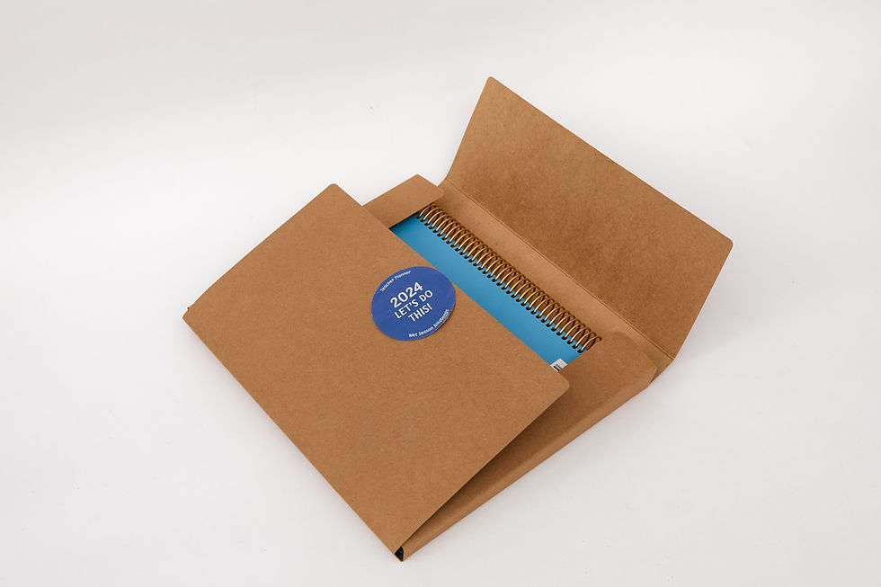
At Lion Paper Products, we understand how crucial colour accuracy is for group buyers. Our factories in China and Cambodia are equipped with Heidelberg printing machines, automatic laminators and spiral binding equipment. More importantly, our quality management team monitors colour consistency at every stage. We adhere to ISO 9001 and SQP standards and employ a colour‑tuning system similar to G7 to maintain stable hues across production runs. Our R&D team can convert your RGB files to CMYK, fine‑tune layouts and create prototypes within 5–7 days. With full sample services and real‑time video recordings of inspections, you can be confident that your notebook colours will match your expectations.
Partner with experts for perfect print colours
Choosing the right partner is as important as choosing the right colour mode. An experienced supplier will help you navigate colour profiles, paper stocks and finishing options.
At Lion Paper, our 10‑person inspection team and international certifications (FSC, SEDEX SMETA, BSCI, Disney FAMA and GSV) ensure compliance and quality. Whether you need classic business notebooks or creative journals with special finishes, we provide end‑to‑end solutions—from concept to packaging—that keep your brand colours consistent.
Ready to see how accurate colour can elevate your notebook range? Contact us today to request samples or discuss your requirements.
Conclusion: making informed colour choices
Understanding the difference between RGB and CMYK is fundamental for notebook buyers. RGB, an additive model, is perfect for digital designs but cannot fully translate into printed form. CMYK, the subtractive model, uses inks to absorb light and is the standard for printing. Designing in CMYK or converting early ensures predictable colours, while sampling and colour management safeguard against surprises.
By partnering with a supplier that prioritizes quality and communication—like Lion Paper—you can transform your designs into vibrant, consistent notebooks that delight your customers.
Want to discover how precise color can enhance your notebook collection? Get in touch with us today to request samples or discuss your needs.
—Leo Xia, CEO, Lion Paper Products
You design, we deliver.
FAQs:
Q1: What is the main difference between RGB and CMYK?
A: RGB is an additive colour model that mixes red, green and blue light to create colours. CMYK is a subtractive model that uses cyan, magenta, yellow and black inks to absorb light on paper.
Q2: Why do printed colours look dull compared to my screen?
A: Screens emit light and can display a wider colour gamut, making colours appear vibrant. Printed pages rely on reflected light, so the CMYK gamut is narrower and certain bright colours can appear muted.
Q3: Should I design my notebook covers in RGB or CMYK?
A: For digital mockups or online promotions, RGB is fine. For printed notebooks, set your document to CMYK or convert before finalizing to avoid colour shifts.
Q4: What file formats are best for printing notebooks?
A: PDF, TIFF, EPS and AI preserve CMYK colour profiles and are widely accepted by printers. Avoid sending RGB JPEGs or PNGs for final print production.
Q5: Can CMYK reproduce all colours?
A: No. CMYK has a smaller gamut than RGB and cannot reproduce certain neon or ultra‑saturated colours. Spot colours or Pantone inks may be required for exact hues.
Q6: How can Lion Paper help me ensure colour accuracy?
A: Our factories employ calibrated presses, strict quality control and full sample services. We convert RGB files to CMYK, provide proofs and adjust colours to match your brand. Our certifications (ISO 9001, BSCI, etc.) and video‑recorded inspections guarantee consistent results.
Are you looking for a reliable manufacturer? Reach out to Lion Paper for a free quote and consultation. Let’s collaborate on creating custom writing paper products that will set your brand apart from the competition!
About Lion Paper
Company Name: Lion Paper Products
Office Address: 20th floor, Chuangyedasha Building, No. 135, Jinsui Road, Jiaxing City, Zhejiang Province, China
Factory Address: No.135, Xuri Road, Jiaxing City, Zhejiang, China
Email: Leoxia@lion-paper.com
Audit Certifications: ISO9001:2015/FSC/SEDEX SMETA/Disney FAMA/GSV/SQP


Comments